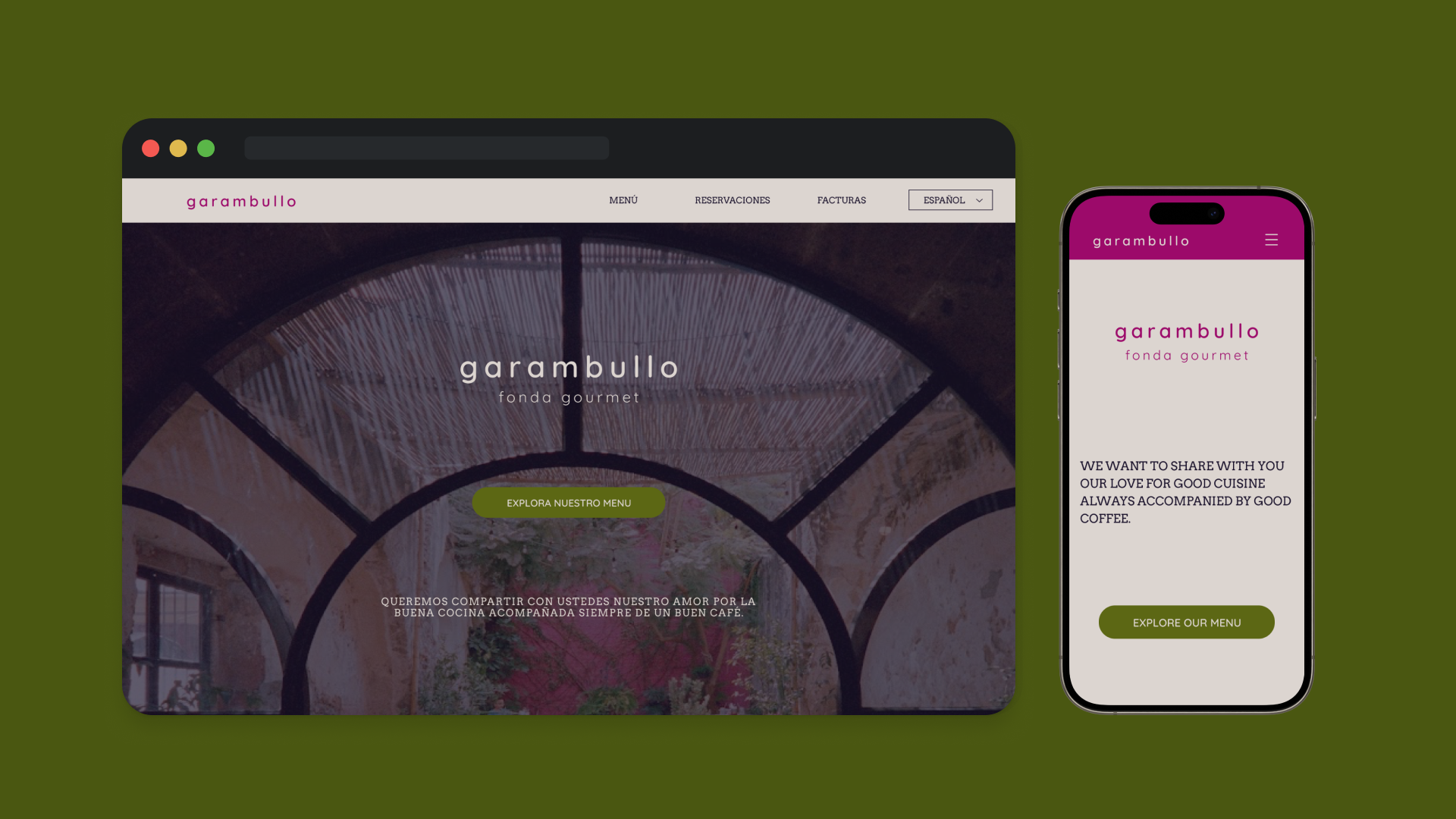
garambullo
This case study explores the development of a responsive web design for Garambullo, undertaken as a key project within the Luna Design initiative at the Apple Developer Academy. The project places a strong emphasis on enhancing user experience, with particular attention to interaction design principles and adherence to WCAG (Web Content Accessibility Guidelines) standards, ensuring a seamless and accessible online environment for all users.
Timeline
August 2024 - March 2025
Skills
Web Design
Interaction Design
Ideation
San Miguel de Allende, celebrated for its 18th-century Baroque and 19th-century Neo-Gothic architecture, is a UNESCO Heritage Site where winding streets echo with charm. Ensuring our branding resonates with this rich heritage and complements the town's existing aesthetic was crucial for sustainable brand integration and longevity.
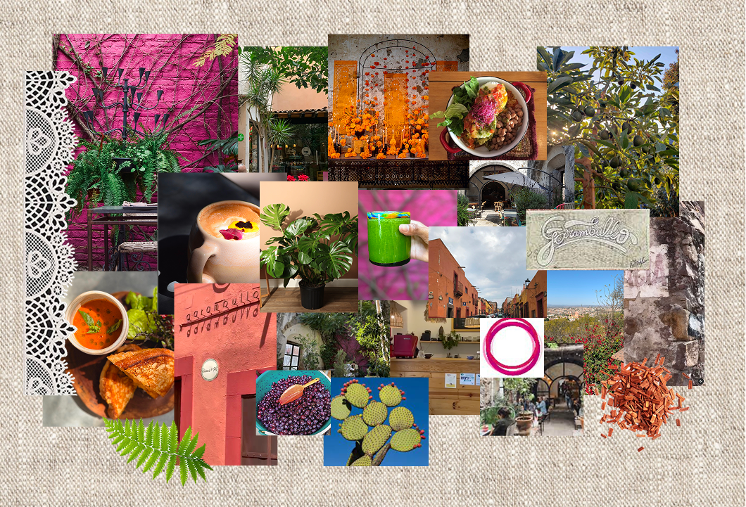
Moodboard
A vibrant fusion where industrial rusticity meets Mexican baroque. The palette juxtaposes earthy, organic tones of linen, moss, and wood with bold accents of magenta and coral, creating a space that feels both grounded and alive with color inspired by local flora.
Style Guide
The visual identity was meticulously crafted to create a seamless transition from the physical shop to the digital experience. The typography pair of Arvo and Quicksand was selected to directly mirror the fonts used on the storefront and menu, ensuring immediate brand recognition and cohesion.
The color palette is built on a foundation of authentic brand cues and accessible contrast. The vibrant Magenta (#890058), established as the brand's primary color in their existing marketing, serves as the key accent. This was balanced with earthy, organic tones pulled directly from the moodboard: a warm Linen (#D4CCC7), a deep Moss (#4A5711), and a rich, near-black Charcoal (#150F21).
Every color combination was rigorously tested to meet WCAG standards, ensuring legibility for all users. Components were optimized for the primary user base, featuring ample touch targets, high-contrast labels, and a clear hierarchy to enable effortless navigation and selection on mobile devices.


